Part II: Analysis
1. What are the contributions of livestock/crops for each different emission type (enteric fermentation, etc ..) ?
In this part, we will study the contribution of each crop/livestock on the different categories of emissions due to agriculture (stated in Part I). FAOSTAT provides us with detailed CSV files for each type of emission. To compute the average ratio over the years, we first group for each year across all countries, sum up all emissions for each emission_type, then take the percentage of each item over its emission.
After that, we take an average over all years to have an average ratio of emissions for each (item, emission_type) pair.
Emissions are expressed in CO2eq units.
Note: Rice cultivation accounts for 100% of Emissions due to Rice cultivation (Eureka!)
| element | Emissions (CO2eq) (Burning crop residues) | Emissions (CO2eq) (Crop residues) | Emissions (CO2eq) (Enteric) | Emissions (CO2eq) (Manure applied) | Emissions (CO2eq) (Manure management) | Emissions (CO2eq) (Manure on pasture) | Emissions (CO2eq) (Rice cultivation) |
|---|---|---|---|---|---|---|---|
| item | |||||||
| Asses | 0 | 0 | 0.00543828 | 0.00128126 | 0.00253567 | 0.0104046 | 0 |
| Barley | 0 | 0.0692639 | 0 | 0 | 0 | 0 | 0 |
| Beans, dry | 0 | 0.0108659 | 0 | 0 | 0 | 0 | 0 |
| Buffaloes | 0 | 0 | 0.0972905 | 0.0578231 | 0.0694453 | 0.0519516 | 0 |
| Camels | 0 | 0 | 0.0103077 | 0.000672085 | 0.00277803 | 0.00724735 | 0 |
| Cattle, dairy | 0 | 0 | 0.192888 | 0.22375 | 0.20536 | 0.101365 | 0 |
| Cattle, non-dairy | 0 | 0 | 0.544465 | 0.263744 | 0.299471 | 0.50617 | 0 |
| Chickens, broilers | 0 | 0 | 0 | 0.0665073 | 0.020468 | 0.0167826 | 0 |
| Chickens, layers | 0 | 0 | 0 | 0.0646865 | 0.0321645 | 0.0166729 | 0 |
| Ducks | 0 | 0 | 0 | 0.0163721 | 0.00378012 | 0.00562943 | 0 |
| Goats | 0 | 0 | 0.0382061 | 0.0144295 | 0.00888142 | 0.0993895 | 0 |
| Horses | 0 | 0 | 0.0137308 | 0.00409583 | 0.00660069 | 0.0269557 | 0 |
| Llamas | 0 | 0 | 0.0020903 | 4.7615e-05 | 0.000468312 | 0.00128571 | 0 |
| Maize | 0.43026 | 0.177421 | 0 | 0 | 0 | 0 | 0 |
| Millet | 0 | 0.0150928 | 0 | 0 | 0 | 0 | 0 |
| Mules | 0 | 0 | 0.00176731 | 0.000380686 | 0.00077499 | 0.00337372 | 0 |
| Oats | 0 | 0.0188354 | 0 | 0 | 0 | 0 | 0 |
| Potatoes | 0 | 0.0301841 | 0 | 0 | 0 | 0 | 0 |
| Rice, paddy | 0.26637 | 0.295004 | 0 | 0 | 0 | 0 | 1 |
| Rye | 0 | 0.013069 | 0 | 0 | 0 | 0 | 0 |
| Sheep | 0 | 0 | 0.0800751 | 0.0573018 | 0.0226515 | 0.151934 | 0 |
| Sorghum | 0 | 0.0354504 | 0 | 0 | 0 | 0 | 0 |
| Soybeans | 0 | 0.0670098 | 0 | 0 | 0 | 0 | 0 |
| Sugar cane | 0.0310476 | 0 | 0 | 0 | 0 | 0 | 0 |
| Swine, breeding | 0 | 0 | 0.00137406 | 0.026593 | 0.0377917 | 0 | 0 |
| Swine, market | 0 | 0 | 0.0123665 | 0.181864 | 0.281389 | 0 | 0 |
| Turkeys | 0 | 0 | 0 | 0.0204511 | 0.00543935 | 0.000837766 | 0 |
| Wheat | 0.272323 | 0.267804 | 0 | 0 | 0 | 0 | 0 |
In columns, we have the different types of emissions of agriculture, and in rows, the ratio for each item. Some values are quite high, and each type of emission is dominated by one or two items:
- Emissions due to burning crop residues are largely dominated by Maize, with almost 43% of CO2eq emissions.
- Crop residues emissions are shared between Rice, Wheat and Maize, with 29%, 26%, and 17% respectivley
- Enteric fermentation is mostly just Cattle (dairy and non-dairy) with a combined 73% of Global emissions.
- Cattle are also quite highly ranked in emissions due to manure (applied to soils, management and left on pasture)
What can we conclude from this analysis ?
It seems that Cattle is the most significant contributor in emissions of CO2eq GHG for multiple sources, with quite high percentages compared to other livestock (Chickens, goats, sheep etc..). This type of livestock is known to have a very high emission factor. Subsequently, we will study the effect of reducing the production of high emission factor items on overall emissions, using more complex models.
2. Have emissions increased proportionally to production ?
In this question, we will study whether emissions and production of different items are have increased proportionally over time. To come up with such metric, we will need to study the emissions per head of livestock animal, and per hectar of cultivated soil.
If it is the case, we should see no increase in this ratio. Let’s work this out
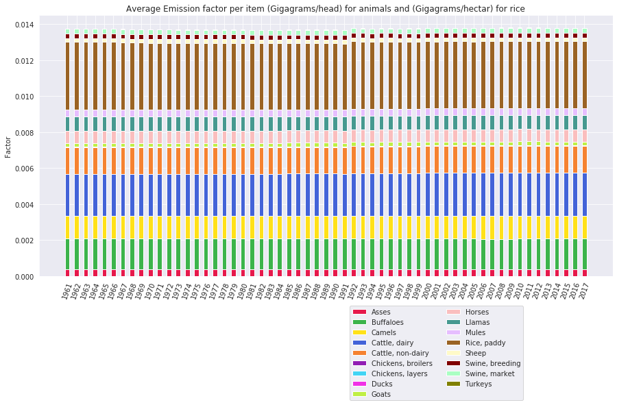
The graph looks nice and straight: Emission factors by Gigagram / head for live animals has not increased or decreased, and the same goes for rice cultivation.
We were not able to obtain an emission factor for various other crops, as the data is not available and trying to reconstruct it would introduce a lot of error margin, which is why we decided to stick with what we have.
The above graphs allows us to conclude the following:
Emissions have only increased due to the increase in production, and is not due to other factors such as different growing or breeding techniques.
3. Which product’s production should be reduced as to reduce emissions ?
In this part, we aim at quantifying the linear relationships between all productions we have (233 different items) and all types of emissions (10 type) that are due to agriculture.
In order to do that, we first compute each pair of production and emission’s correlation over the years using Pearson’s Correlation Coefficient for every country, and then average the correlation over all the countries.
This yields a dataframe with 2330 correlation coefficients (a bit less due to data inconsistency). These will be useful later on when we will want to build regressive models that estimate different emissions based on production items.
We will study the correlations for Live animals, Livestock produce and Crops independantly
3.1. Live animals
From the previous anylsis, we know that live animals only contribute to 4 types of emissions: Enteric fermentation, Manure Mangement, Manure applied to soils and Manure left on pasture. For this reason, we will only take into account correlations with these emission types, as even if we have large correlations with other types, we know they do not apply.
| item_x | Enteric Fermentation | Manure Management | Manure applied to Soils | Manure left on Pasture |
|---|---|---|---|---|
| item_y | ||||
| Animals live nes | -0.0174319 | 0.559531 | 0.530239 | -0.0536317 |
| Asses | 0.192255 | 0.140286 | 0.119927 | 0.193451 |
| Beehives | 0.348389 | 0.386578 | 0.408019 | 0.324757 |
| Buffaloes | 0.447421 | 0.284779 | 0.217855 | 0.316874 |
| Camelids, other | 0.801259 | 0.801915 | 0.78622 | 0.788628 |
| Camels | 0.412462 | 0.366456 | 0.315086 | 0.373481 |
| Cattle | 0.901706 | 0.689737 | 0.661271 | 0.80322 |
| Chickens | 0.431695 | 0.610417 | 0.696948 | 0.511537 |
| Ducks | 0.305179 | 0.417602 | 0.47472 | 0.380987 |
| Geese and guinea fowls | 0.289634 | 0.299573 | 0.332088 | 0.328897 |
| Goats | 0.417793 | 0.435975 | 0.41988 | 0.490726 |
| Horses | 0.179563 | 0.146376 | 0.115398 | 0.219399 |
| Mules | 0.0719545 | -0.0160093 | -0.0486916 | 0.0582932 |
| Pigeons, other birds | 0.224025 | 0.352663 | 0.329942 | 0.217039 |
| Pigs | 0.417244 | 0.706259 | 0.64776 | 0.400493 |
| Rabbits and hares | 0.316292 | 0.322828 | 0.341396 | 0.264436 |
| Rodents, other | 0.0281794 | 0.0519693 | 0.104789 | -0.00175626 |
| Sheep | 0.525571 | 0.454382 | 0.43425 | 0.591585 |
| Turkeys | 0.190052 | 0.270763 | 0.348869 | 0.16829 |
The results are coherent with the previous calculations based on contributions:
- Cattle has a high correlation coefficient with all 4 emission types, and most with enteric fermentation. We previously saw that Cattle (dairy and non-dairy) account for almost 75% of this type of emission. Also, in the begining of our study, we showed that Enteric Fermentation accounts for 67% of CH4 Emissons of this economy. Simple calculations yield a global contribution to CH4 gases of 50% for Cattle !!
- Camelids seem to also have a high coefficient with the 4 emission types, but we previously saw that they only account for 1% of emissions.
- Mules have the lowest correlations with all 4 types.
3.2. Livestock Produce
| item_x | Enteric Fermentation | Manure Management | Manure applied to Soils | Manure left on Pasture |
|---|---|---|---|---|
| item_y | ||||
| Eggs, hen, in shell | 0.412908 | 0.545695 | 0.604489 | 0.465691 |
| Eggs, other bird, in shell | 0.309624 | 0.389675 | 0.412316 | 0.388253 |
| Hides, buffalo, fresh | 0.51327 | 0.388345 | 0.317292 | 0.443552 |
| Hides, cattle, fresh | 0.644473 | 0.549103 | 0.561979 | 0.598171 |
| Meat indigenous, ass | 0.618647 | 0.606011 | 0.612212 | 0.664896 |
| Meat indigenous, bird nes | 0.406118 | 0.47996 | 0.477989 | 0.393133 |
| Meat indigenous, buffalo | 0.524501 | 0.393947 | 0.319995 | 0.466484 |
| Meat indigenous, camel | 0.492636 | 0.475989 | 0.441158 | 0.461859 |
| Meat indigenous, cattle | 0.649031 | 0.562492 | 0.579772 | 0.599394 |
| Meat indigenous, chicken | 0.335482 | 0.506006 | 0.576824 | 0.416985 |
| Meat indigenous, duck | 0.285317 | 0.430394 | 0.4885 | 0.369011 |
| Meat indigenous, geese | 0.283109 | 0.29714 | 0.35201 | 0.386369 |
| Meat indigenous, goat | 0.419219 | 0.459889 | 0.46479 | 0.496667 |
| Meat indigenous, horse | 0.228973 | 0.178327 | 0.170462 | 0.201469 |
| Meat indigenous, mule | 0.384295 | 0.343165 | 0.350966 | 0.492918 |
| Meat indigenous, other camelids | 0.207807 | 0.13084 | 0.0869365 | 0.25663 |
| Meat indigenous, pig | 0.383557 | 0.596138 | 0.59727 | 0.404523 |
| Meat indigenous, rabbit | 0.452466 | 0.453528 | 0.46761 | 0.429909 |
| Meat indigenous, rodents | -0.017406 | -0.001253 | 0.0548468 | -0.033011 |
| Meat indigenous, sheep | 0.449696 | 0.452507 | 0.453786 | 0.505047 |
| Meat indigenous, turkey | 0.0776512 | 0.141508 | 0.23715 | 0.0815831 |
| Meat, ass | 0.673004 | 0.667397 | 0.670024 | 0.721188 |
| Meat, bird nes | 0.398516 | 0.413742 | 0.407648 | 0.390383 |
| Meat, buffalo | 0.595647 | 0.42929 | 0.357446 | 0.48325 |
| Meat, camel | 0.577347 | 0.573849 | 0.527851 | 0.561492 |
| Meat, cattle | 0.611846 | 0.546762 | 0.565477 | 0.588957 |
| Meat, chicken | 0.322612 | 0.497971 | 0.565292 | 0.407622 |
| Meat, duck | 0.265477 | 0.38811 | 0.448873 | 0.327401 |
| Meat, game | 0.389236 | 0.482325 | 0.505708 | 0.404113 |
| Meat, goat | 0.37308 | 0.3989 | 0.405535 | 0.442325 |
| Meat, goose and guinea fowl | 0.310403 | 0.337075 | 0.393374 | 0.400975 |
| Meat, horse | 0.240358 | 0.161244 | 0.154695 | 0.253028 |
| Meat, mule | 0.371703 | 0.330178 | 0.331309 | 0.482602 |
| Meat, nes | 0.263154 | 0.298796 | 0.340809 | 0.288018 |
| Meat, other camelids | 0.433639 | 0.384046 | 0.373344 | 0.47001 |
| Meat, other rodents | -0.00404508 | 0.00799845 | 0.0557307 | -0.0229908 |
| Meat, pig | 0.368533 | 0.588932 | 0.583096 | 0.387766 |
| Meat, rabbit | 0.399239 | 0.397631 | 0.416648 | 0.3688 |
| Meat, sheep | 0.459739 | 0.447937 | 0.445679 | 0.501001 |
| Meat, turkey | 0.0446689 | 0.141992 | 0.232042 | 0.061515 |
| Milk, whole fresh buffalo | 0.377427 | 0.395695 | 0.355487 | 0.422006 |
| Milk, whole fresh camel | 0.582061 | 0.560904 | 0.53383 | 0.572511 |
| Milk, whole fresh cow | 0.575445 | 0.590129 | 0.641824 | 0.564405 |
| Milk, whole fresh goat | 0.42863 | 0.432774 | 0.420051 | 0.468469 |
| Milk, whole fresh sheep | 0.484644 | 0.466679 | 0.471685 | 0.553379 |
| Skins, goat, fresh | 0.403191 | 0.441643 | 0.439507 | 0.465534 |
| Skins, sheep, fresh | 0.46452 | 0.448705 | 0.44143 | 0.5217 |
| Skins, sheep, with wool | 0.382813 | 0.375227 | 0.380435 | 0.467755 |
| Snails, not sea | 0.518544 | 0.312585 | -0.291296 | 0.435402 |
3.3. Which produce generates the most emission per unit ?
Studying the overall impact of each produce is interesting, but these values can be biased by the fact that there are more animals. It would be interesting to see what is the impact of each product, per unit.
Most emissions here are computed for each animal, and we included Rice too, where emissions are expressed in Gigagrams/hectar/year, while animals are in Gigagrams/Head / year.
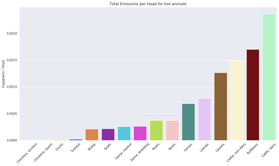
This plot is very intersting, as it confirms previous findings: Cattle seem to be a a huge contributor to emissions, with an emission factor of 0.002 Gigagrams / Head or 2 metric tonnes per year. Compared to poultry animals this is huge. This suggests that reducing the population of cattle and increasing the population of Chickens, would in fact have a positive impact on reducing the global emissions.
This would also mean reducing the amount of produce generated from cattle: Milk, Beef and skins.
3.4. Exploring nonlinear correlations
In order to better understand our dataset, we wished to develop an anlaytic method for measuring non-linear dependencies between our different time series data. More specifically, we want to analyse the impact of the multivariate timeseries across timestamps [t-n,t] on a target time series at timestamp t.
The approach we followed consisted of:
- Finding a function mapping multivariate time series to a single scalar value of an output time-series. To do this, we fit a multivariate LSTM to our data.
- Finding the contribution of each value to the ouput time-series scalar value. To do this we use Shapely Values.
Before going any further, let us note that we transform our time series into a series of ratios between adjacent values, and then subtract 1 from all values. Negative values thus signal decreases in the time series, positive values signal an increase, and 0 indicates that the time series is stable.
More formally, the Shapley Value of a feature is its contribution to the payout, weighted and summed over all possible feature value combinations. Payout is defined here simply as the output of our mapping. Since our mappping outputs the predicted rate of change in our target time series minus 1, the abosulte value of our mapping output becomes a measure of the rate of change of our time series . By calculating Shapely Values for each element of our input multivariate timeseries, across a set of input samples, and extracting the mean absolute value of the Shapely Values per input element, we can quantify how the variations in a set of timeseries impacts the variation in a target timeseries, accross different timestep latencies. Note that by taking mean absolute values, we are measuring the strength of the impact of one variation on another, and not the direction of that influence.
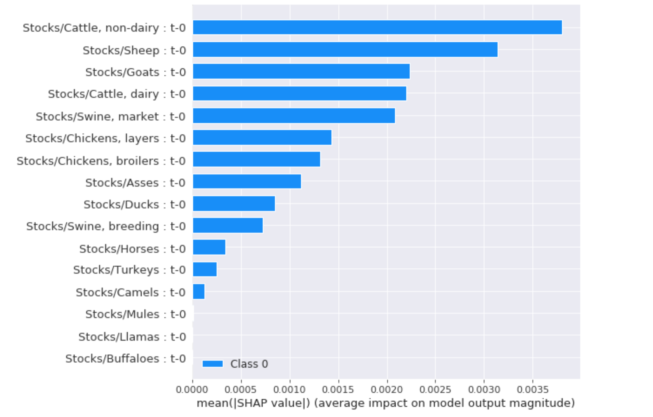
In the example below, we use our method to study the impact of variations in animal head counts on variations in overall emissions due to agriculture. We are studying the impact of those variations with a timestep lag of 0, as we wish to minimize the number of input features. The largest impacts come from Sheep, Goats, Cattle, Swine and Chicken. The smaller impacts of other animals can be explained by their very small head counts.
In order to understand our results, lets look at Sections II.1 and II.3.3. From the numbers presented in these two sections, we see that Cattle and Swine represent large portions of emissions from livestock. As head counts of Cattle and Swine are also large, it becomes clear that variations in head counts of these two animals must significantly impact emissions – the lesser impact of Swine with respect to Cattle can be explained in by the lower values of emissions/head for Swine ( Section II.3.3 )
Understanding the impact from Sheep, Goats and Chicken is more subtle. Both of these animals represent small portions of overall worldwide emissions due to livestock, so why would variations in these significanly impact variations in emissions ? We can find part of the answer by looking at emissions per head in Section II.3.3 : these two animals are the only two animals with very low emissions/head values which do not represent insignificant portions of overall worldwide emissions – as such, variations in Goat and Sheep counts in and of themselves cannot impact overall emissions significantly, so our results must be explained by another hidden iteraction : an inverse correlation between increases in Goat/Sheep/Chicken counts and Cattle/Swine counts would explain our results. In conclusion, our previous findings are confirmed: to affect overall emissions, Cattle and Swine consumption must be reduced as much as possible, and Goat, Sheep and Chicken consumption must be increased.
-
Lipovetsky, Stan, and Michael Conklin. “Analysis of regression in game theory approach.” Applied Stochastic Models in Business and Industry 17.4 (2001): 319-330
-
Shapley sampling values: Strumbelj, Erik, and Igor Kononenko. “Explaining prediction models and individual predictions with feature contributions.” Knowledge and information systems 41.3 (2014): 647-665