Part I: Exploration
1. What is the overall impact of the agriculture industry on global green house gas (GHG) emissions ?
This first question that naturally comes to mind. FAO provides data regarding emissions from multiple sectors. Green house gase emissions are computed using CO2eq (i.e. CO2 equivalent) from multiple gases (CO2, CH4, N20, and F-gases), which are in top list of Green House Gases.
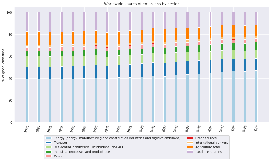
It seems that agriculture has stayed around 10% of global emissions by sector for the years 1990-2010. Now we shall look at the share of this emissions for each gas, only looking at the World wide Agriculture emissions.
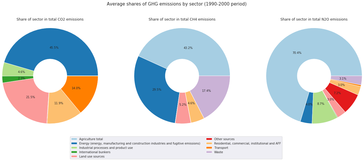
From this pie chart, we can learn a few things for the Agriculture industry:
- It seems that direct CO2 emissions from Agriculture are absent (0%). This makes sense as CO2 is not directly emitted. However, the CO2 emissions might be indirect, as food is always transported via non carbon-free methods, and industrial machinery is used in agriculture, and requires energy.
- Global CH4 Emissions are shared between Agriculture and Energy industries, with a majority for Agriculture (41.4%)
- Global N2O are largely dominated by the Agriculture industry (70%)
All of these gases are considered top level Green House gases. It makes sense now to focus on searching where those emissions come from in detail (only for agriculture), and how can we reduce them without comprimising the diet of the population.
Now we know which GHG are largely emitted by the agriculture industry, and that Agriculture contributes to roughly 10% of global Emissions, but largely dominates other sectors in terms of CH4 and N2O emissions.
However, this plot does not take into consideration indirect emissions due to Agriculture:
- Emissions due to transport of food (included in “Transport” sector)
- Emissions due to use of energy for producing agricultural products (included in “Energy”)
Our analysis focuses more on the direct emissions of Agriculture, and hence we will not take those aspects in consideration as they fall outside of the scope.
1.1. What are the sources of CH4 and N2O emissions from in the Agriculture Industry ?
To illustrate this, we can separate the emissions of both gases into 10 items related to agriculture: Enteric Fermentation, Manure management, Rice Cultivation, Synthetic Fertilizers, Manure applied to soils, Manure left on Pasture, Crop residues, Burning of crop residues, Burning of savanna and Cultivation of organic Soils.
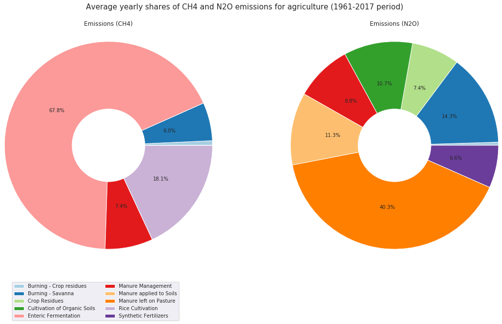
This pie chart illustrates quite well the origin of emissions of CH4 and N2O, in the agriculture industry. Before interpreting the chart, let’s brievly explain what each item represents:
- Burning - Crop residues: Agricultural practice that consists of combusting a percentage of crop residues on site
- Burning - Savanna: Periodic prescribed burning of savanna for agricultural purposes
- Enteric Fermentation: Digestive process by which carbohydrates are broken down by micro organisms into simple molecules for absorption into the bloodstream of an animal.
- Manure Management: Refers to capture, storage, treatment, and utilization of animal manure
- Rice Cultivation: Agricultural practice for growing rice seeds
- Crop Resdiues: Agriculture management practice that consists in returning to managed soils the residual part of the produce
- Cultivation of Organic Soils:
- Manure applied to Soils: Animal waste distributed on fields in amounts that enrich soils
- Manure left on pasture: Animal waste left on managed soils from grazing livestock.
- Synthetic Fertilizers: Inorganic material of synthetic origin added to a soil to supply one or more plant nutrients essential to the growth of plants.
-
CH4 Emissions:
- Direct CH4 emissions of agriculture are mostly dominated by the Enteric Fermentation of Livestock (69.4%), which means that this particular source of emissions accounts for rougly 30% of the global CH4 Emissions, which is quite significant.
- Rice Cultivation also is a big contributor (18%) to the emissions of this GHG.
- Other sources have much lower contribution to emissions of this gas
-
N2O Emissions:
- The biggest contributor is “Manure Left on Pasture”, followed by Synthetic Fertilizers.
- The use of Manure (Manure management, left on pasture, and applied to soils) have a contribution of roughly 40% (together) of N2O Emissions for agriculture.
1.2. How have global emissions of those gases from each source evolved in the past years ?
Having an average share of each source over the past 50 years gives us a general idea of where the emissions come from. Additionally, the evolution of emissions in this time frame is also interesting.
We all know Global emissions have increased worldwide, but what are the sources of this increase in the agricultural sector ?

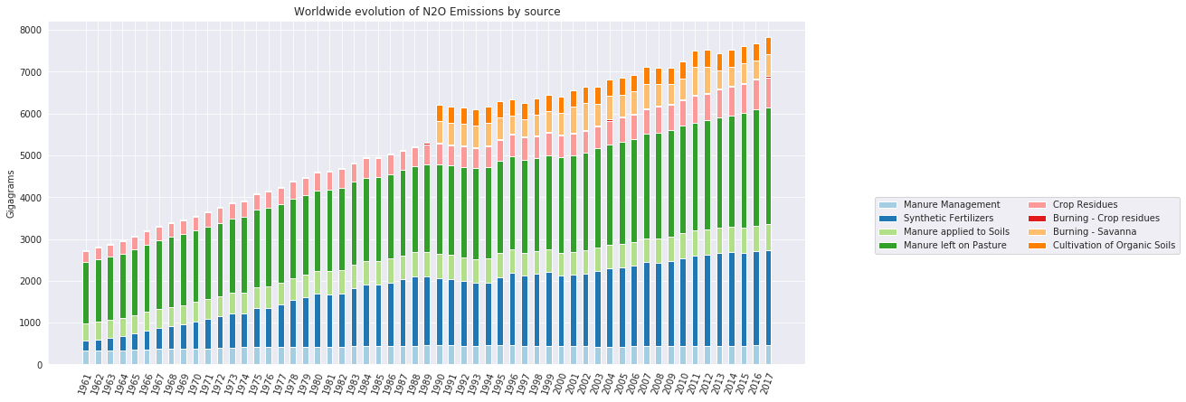
We can notice a clear linear increase in the emission of both gases , with a slight peak in 1990-1995. We can see that some items only start appearing around that period of time, so this explains the spike.
1. Emissions of CH4:
As seen previously, we knew that CH4 emissions are dominated by the Enteric Fermentation, and we can see that it has increased by roughly 50% since 1961. However other sources do not seem to have had the same increase in emissions.
2. Emissions of N2O:
Increases here are more interesting. We can see that emissions due to Synthetic fertilizers have increased linearly by almost 400%, with slightly lower steepness after ~1995. The reason for this seems to be the same as for CH4 Emissions: additional information haas been added Manure Management’s emissions also increased linearly.
1.3. Which countries contribute the most to emissions due to agriculture ?
We now have a global view on emissions worldwide, but it would be interesting to have a more detailed approach and see which countries countribute the most to the emissions of those 2 gases.
1. Raw data
First we plot the total emissions in gigagrams for each country and gas (for CH4 and N2O) as a heatmap.
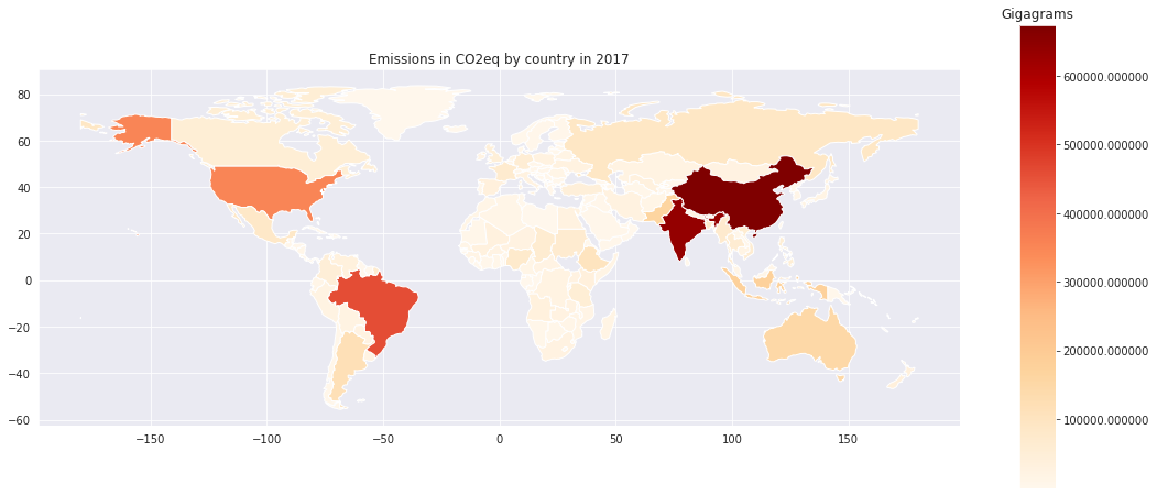
It looks like 4-5 countries contribute much more than others to emissions of the two gases: China, India, United States, Brazil and Australia. However, these countries’ populations are quite signifcant. Let’s look at the same graph, but after normalizing by population.
2. Normalized by population
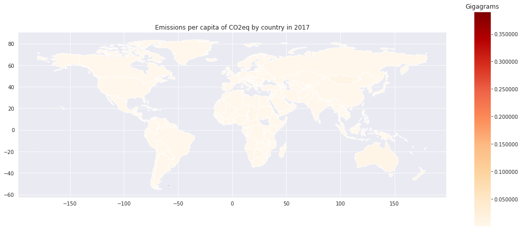
At a first glance, it seems that all countries have similar values of emission gigagrams/capita, but the scale tells us that some countries have higher values. Let’s plot the distribution of values and check how it behaves.
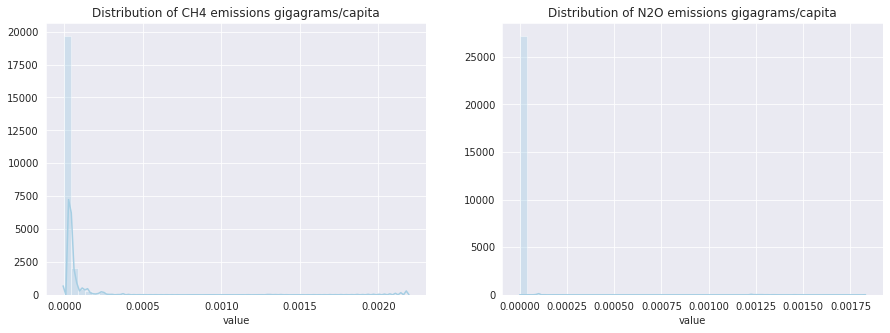
The values seem to be very concentrated around 0, but both distributions have a very long tail. This could be due to a faulty value for one or a couple of countries.
After further inspection, we saw that one country seems to stand out and has a much higher value: Falkland Islands, a small group of islands in the southern Atlantic, with a population of around 3000 people. These islands seem to have a quite high livestock/capita ratio, according to their website Falkland Government Website. For visualization purposes, we will drop this line and replot the maps.
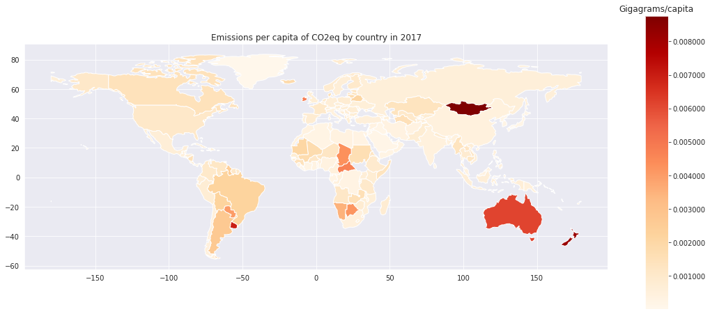
The map looks much better now. We can see which countries stand out: Australia and Mongolia seem to have a very high emission factor per capita for both gases.
1.4. Which countries contribute the most to emissions due to agriculture ?
Before pursuing further, it would also be useful to have an evolution of emissions of different countries over time. Such a visualization requires us to use interactive maps with a slider to change the years
2. How has the agriculture industry evolved in the time frame ?
Now that we have a general idea on the different gas emissions due to agriculture, as well as information on which countries contribute to emissions, we will look through a different lens, and study the evolution of the industry over the given time frame
2.1. What kind of crops/livestock increased in production in this time frame ?
We will now shift our focus to production of various crops and livestock. The data is separated in 3 categories: Livestock (live animals), Livestock produce (meat, eggs, etc..) and Crops.
1. Evolution of Livestock stocks
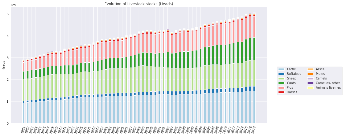
As expected, of course, all stocks of live animals have increased. These take into consideration all animals used to produce food: it can be dairy cattle, layer chicken etc..
Now we normalize by population to see if the increase is proportional to the increase in population
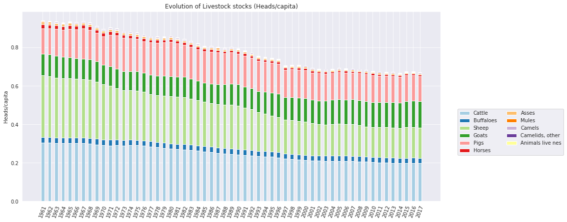
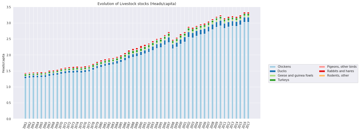
Surprisingly, the amount of “Sheep and Goats” and “Cattle and Buffaloes” per capita seems to be decreasing, while for Poultry birds it is clearly increasing. This could be due to multiple factors:
- Cattle, Sheep and Goats need more time to grow, enducing a higher cost in production
- Poultry Birds are cheaper to feed, need less space to grow, and we have developped techniques where they can be stacked by millions easily, which is not the case for bigger animals.
- The increase in population was more dominant in countries where Red meat consumption is lower (India).
- People prefer to eat chicken today rather than in the 60s
In 2017, there was 3 chickens per living person on earth.
2. Evolution of production of Livestock products
Let’s look at the worldwide evolution of livestock production per year.
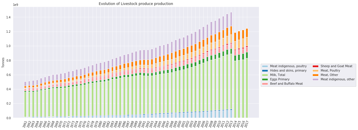
There seems to be a drop in production of Meat indigenous, poultry and Meat indegenous, other, and after inspection, it seems this data is missing for the years 2014 up to 2017. If we need to, we can use time series to complete the items related to this itemgroup for each country.
Also, we can notice clear drastic increases in all productions, but we need to factor in the growth in population too. For that, we normalize by the world population as done earlier
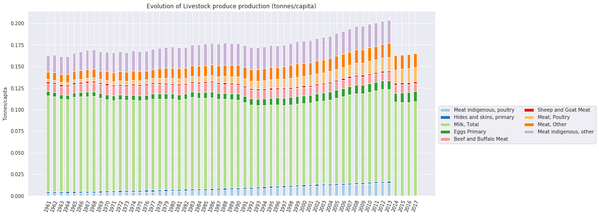
What this graph tells us:
- The overall production of livestock produce did not increase a lot (per capita) during 1961-1995, but took quite a signifcant upward trend in the last 2 decades (1995-2015), growing from 175kg per capita to 200kg per capita (14% increase in 20 years).
- Beef/buffalo meat did not increase a lot in terms of tonnes/capita, as well as Milk production.
- The most flagrant increases in tonnes/capita are in
poultrymeat (indegenousand regular), as well asIndegenous meat, but it contains the latter.
3. Evolution of Crops production
The itemgroups here are quite overlapping, and it is hard to actually decide which to drop and which not. For visualization purposes, we will keep all item groups, but the some itemgroups intersect and are not exclusive.
The itemgroup All crops has been dropped, as it overlaps with a lot of other groups. However, we kept all items that are only present in this itemgroup and named the new itemgroup Other crops
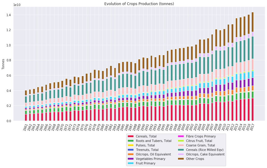
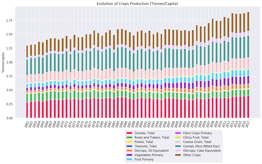
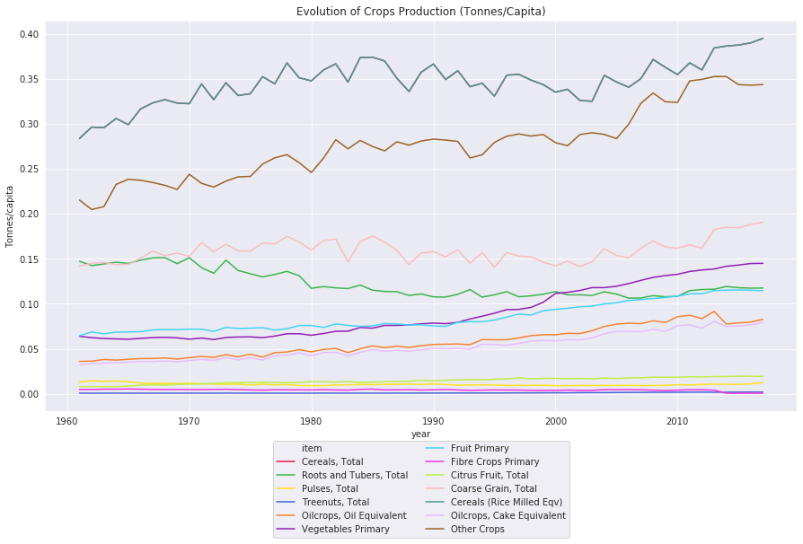
The overall shape of the bars are similar to livestock production:
- We can see an increase in tonnes/capita between the 60s and 70s, and a stagnation after that. And another significant increase in the years after 2000.
- Production per capita seems to have had an increase in:
cereals,vegetables,fruits, andother crops
2.2. What is each country’s top production for crops and livestock produce ?
We thought it would be interesting to visualize the top production of livestock/crop for each country, as it might be correlated with the country’s emission magnitude.
1. Evolution top crop production
2. Evolution top livestock production
2.3. How did Synthetic Fertilizer use change over time ? And what is was it’s effect on production/yield and GHG emissions ?
This question is more related to crops. This type of Fertilizers started being used in the beginnin of the 20th century, after Fritz Haber inventing Haber–Bosch process, a method used in industry to synthesize ammonia from nitrogen gas and hydrogen gas.[1]
Greenhouse gas (GHG) emissions from synthetic fertilizers consist of nitrous oxide gas from synthetic nitrogen additions to managed soils. Specifically, N2O is produced by microbial processes of nitrification and de-nitrification taking place on the addition site (direct emissions), and after volatilization/re-deposition and leaching processes (indirect emissions)
1. History of Fertilizer use
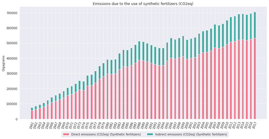
We are only provided with the use of Nitrogenous fertilizers, and its related emissions.
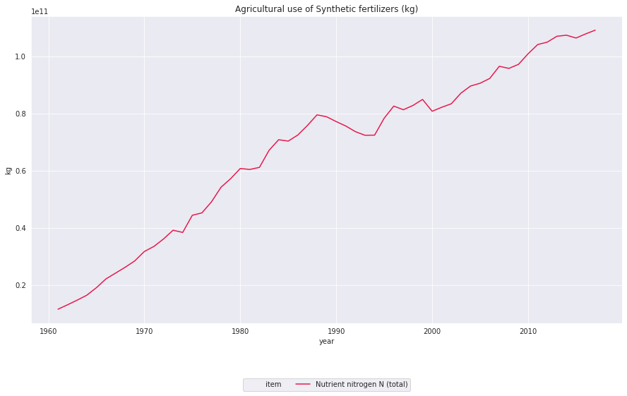
Along this time frame (1961-2017) the use of synthetic fertilizers been multiplied by at least 5, which is pretty impressive.
It would be interesting to see if the the increase in yield is similar (by factoring out the increase in production of course). For that, we would need to study the amount of fertilizers used per ton of production, and relate this quantity to the yield of each product. However, this dataset is quite limited, as we only know the overall use of fertilizers, and not for each crop, making it quite hard to study this.
Despite that, our analysis is more focused on the environmental impact of the industry, so we will concentrate on the emissions due to the use of those fertilizers.
2. Emissions due to synthetic fertilizers
As previously mentionned, synthetic fertilizers generate N2O in either a direct way, or an indirect way. However, to be fair with our comparisons later on, we will express those values in terms of COeq (i.e. the equivalent of N2O in CO2, because N2O has much higher GHG effects than CO2)